
Agenda
Conference dates: 19-20 May 2026
Masterclass dates: 18, 21, 22 May 2026

What we cover
Discover how AI, Python and the latest new functions are shaping the Excel world and the ways you can take advantage of it.
Turn raw numbers into stories that stick. With Excel and Power BI, discover tools to captivate audiences and drive your message home.
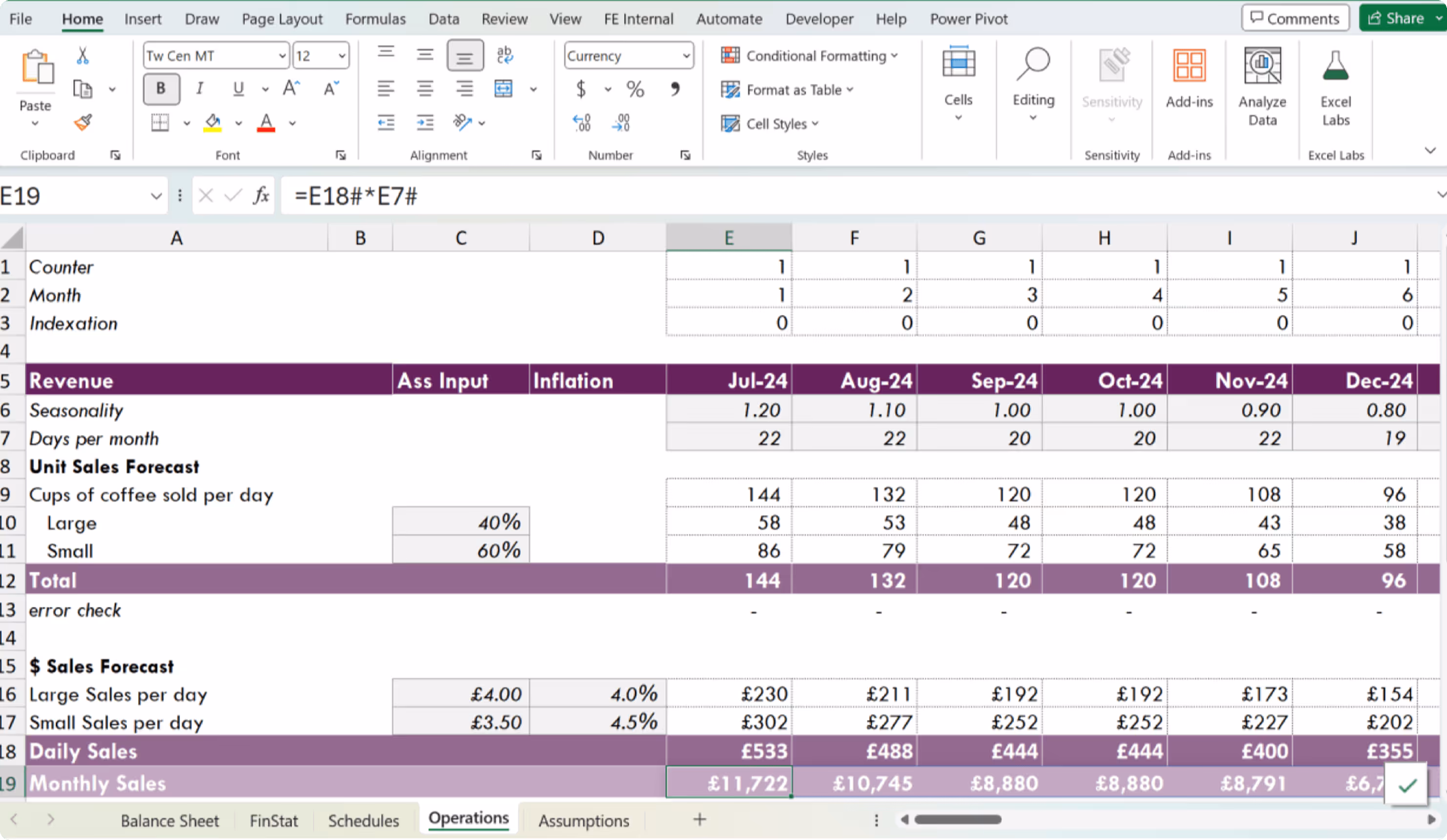
Learn the art and craft of budgeting, forecasting, and modelling to build rock-solid financial models in Excel that won’t implode.
Master Power Query, Power Pivot, Power BI and Power Automate as you discover effective ways to clean, transform, and analyse data.
Complete tasks quicker by constructing more efficient formulas and tapping into Excel’s range of automation capabilities.

Don't hide! There are a range of ways to interact and build relationships, ensuring an experience that spills beyond the duration of the event.
All Sessions
18 May 2026

19 May 2026
🎤 Hosted by Fay Bordbar and Giles Male
Registration for all onsite attendees takes place between 8:15-9:00am at 21Soho club, 3-5 Sutton Row, London W1D 4NR, UK (1min walk from conference venue).
Has Excel quietly outgrown the limits we keep placing on it? The things we say Excel can't do are worth checking from time to time.
Live demo by Jakob Nielsen, Microsoft Excel Principal Designer
This session is not about replacing Excel; it’s about removing the fragile parts of shared workbooks and turning your proven Excel logic into solutions you can share confidently and safely.
Discover next-gen financial modelling tools and techniques.
Take a break, grab a coffee and enjoy a quick snack.
Explore how Excel powers financial modelling in the City of London, and where to access real-world best practice despite industry paywalls.
Throughout his career, Ian Schnoor has worked with thousands of Excel users as they climb from novice to expert. During this session, he will describe the hardest part of the journey (Hint: it's not a lookup, LET or LAMDA).
Discover how timeless modelling techniques can make you shine - only now with the added power of Python in Excel.
Get some food, rest a bit and get ready for what's coming next!
Two champions. One model. Live pressure, zero margin for error—see who builds, thinks, and wins faster.
Insights from a PwC Valuation & Modelling Advisory Director
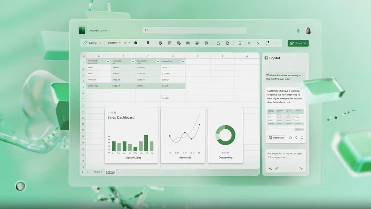
Learn how Excel and Power BI unlock the hidden voices of your data, turning numbers into living visuals that surprise, inspire, and wow.
What if your Excel data was always up to date and working for you? Join us to see how ExtendInsights uses AI and SQL to deliver live, automatically refreshed data directly into your spreadsheets.
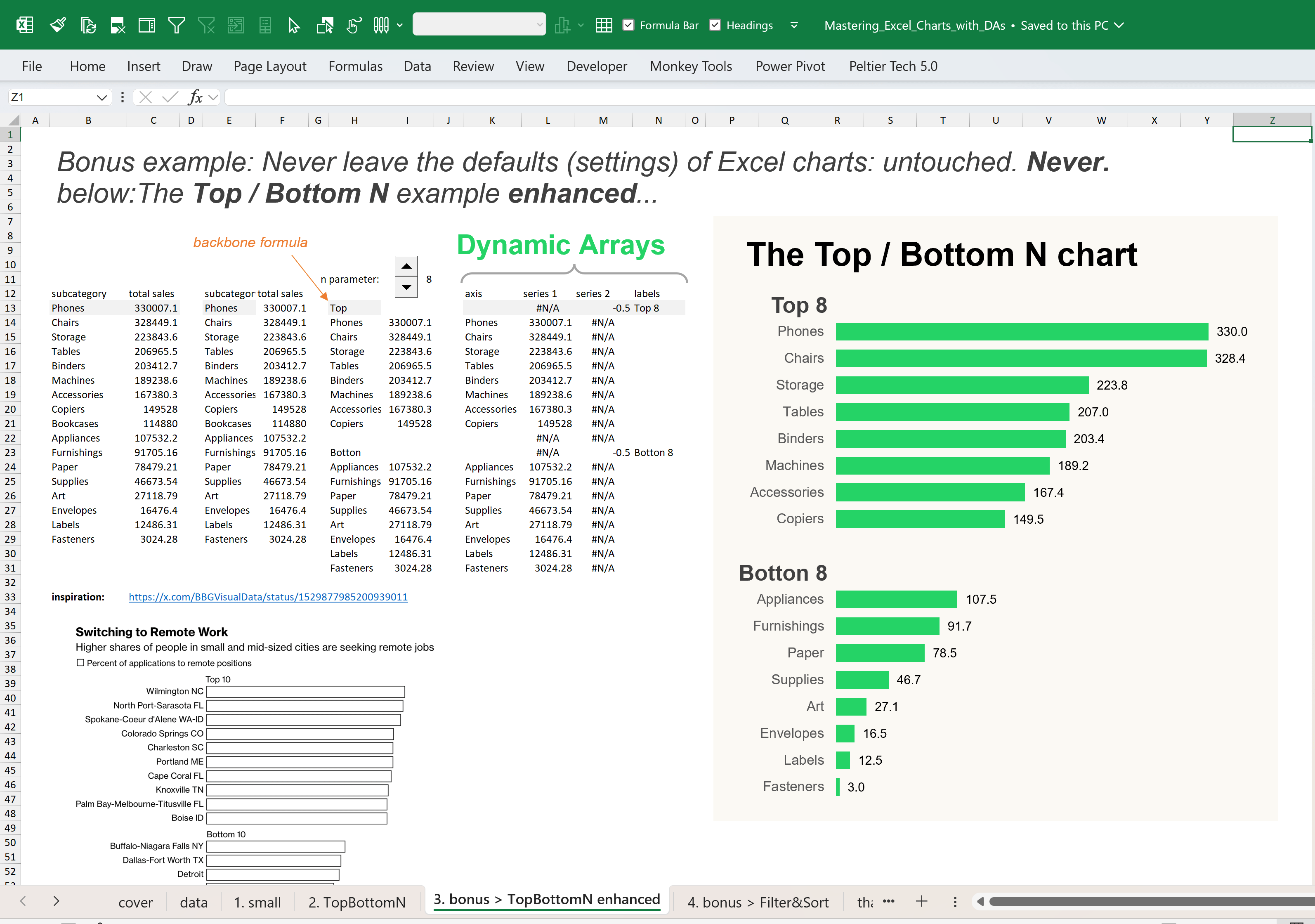
From symbol fonts and conditional formatting to underused chart types and accessibility best practices - master techniques you can apply immediately.
Networking time for all event attendees. Meet and mingle with others, and enjoy FREE refreshments!
20 May 2026
🎤 Hosted by Fay Bordbar and Giles Male
Discover how to modernise legacy data workflows using AI-powered automation with Damien Bird, Senior Cloud Solutions Architect at Microsoft
Go beyond traditional Excel: leverage Copilot and Python to automate analysis and bring advanced data techniques into your daily workflow.
Is Excel still just a personal tool? What if teams could use it without compromising data security and sovereignty? What if it could bridge the ERP world and human intelligence?
Take a break, grab a coffee and enjoy a quick snack.
Have you overlooked how Excel handles values? Explore values in depth and uncover Excel behaviours which you never knew existed.
Discover some of the powerful techniques Wyn Hopkins uses to build polished, scalable Excel solutions for clients around the world.
Pebble Stream is a spreadsheet product that enables Excel users to create cloud-scale computing workflows.
Get some food, rest a bit and get ready for what's coming next!
With Victor Momoh
Power BI vs. Excel - the ultimate data face-off you can’t afford to miss!
The Global Excel Awards 2026 reaches its climax, as the winners of five prestigious awards are revealed.
Networking time for all event attendees. Meet and mingle with others, and enjoy FREE refreshments!
21 May 2026
Explore best practices, advanced workflows, creative charting techniques, and powerful mapping and formatting tricks.

Ann K. Emery
22 May 2026


.png)
.png)

.png)


%20-%20GES2026.png)


.png)


.png)


%20-%20GES2026.png)


.png)


.png)
%20-%20GES2026.png)


Join the Master Club
Your exclusive all-access pass to our entire digital learning experience for a whole year.
.png)