Data Viz & Analytics
Unlock the secrets to showcasing data with style and substance as you unearth Excel’s and Power BI’s rich visualisation possibilities.
All Sessions
Link
14 Mar
1:00 pm
-
1:45 pm
Modern Excel Dashboards: From Messy to Magical
More information coming soon
Link
14 Mar
2:00 pm
-
2:45 pm
How to create “wow-effect” maps that go beyond regional references?
Just simple, native data visualisation features, proving that simple can be incredible.
Link
19 May
2:40 pm
-
3:20 pm
When Tables in Excel speak
Learn how Excel and Power BI unlock the hidden voices of your data, turning numbers into living visuals that surprise, inspire, and wow.
Link
19 May
3:20 pm
-
3:50 pm
Power Your Excel with Live, Automated Data
What if your Excel data was always up to date and working for you? Join us to see how ExtendInsights uses AI and SQL to deliver live, automatically refreshed data directly into your spreadsheets.
Link
19 May
3:50 pm
-
4:30 pm
40 data visualization tips for Excel’s 40th anniversary
From symbol fonts and conditional formatting to underused chart types and accessibility best practices - master techniques you can apply immediately.

Giles Male

Diarmuid Early

Global Excel Summit

Our Masterclasses
.png)
Tony de Jonker
.png)
Laura Szepesi

Giles Male

Sue Bayes
.png)
Ha Dang

Puneet Gogia

Damien Bird
%20-%20GES2026.png)
Chris Corcoran

Jakob Nielsen

Rafaël Le Saux
.png)
Bediako George

Kenny Whitelaw-Jones

Ian Pay

Ken Puls, FCPA, FCMA

Brian Egger

Ann K. Emery

Diarmuid Early
%20-%20GES2026.png)
Massimo Maresca

Carolina Lago

Ian Schnoor, CFA, CFM

Scott Rollans

Wyn Hopkins

Victor Momoh
.png)
Karen Abecia

Alan Murray

Gašper Kamenšek
.png)
Rob Langrick
%20-%20GES2026.png)
Cristiano Galvão

Danielle Stein Fairhurst

Tea Kuseva

Andrew Moss

George Mount

Celia Alves

Ben Richardson

Bob Umlas

Chandoo

Bill Jelen (Mr Excel)

Donald MacCormick

Carlos Barboza

Fay Bordbar

Mark Proctor

Leila Gharani
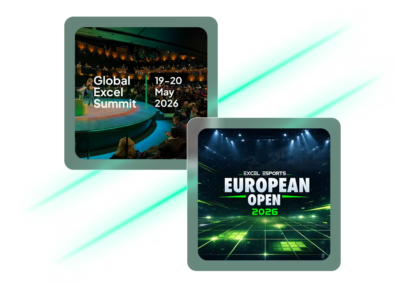
19-23 May 2026
One week, two premier events
Join the European Excel Week - from learning and mastering new skills at Global Excel Summit to elite performance at the Excel Esports European Open.


.avif)