
What comes to mind when you hear the word Excel?
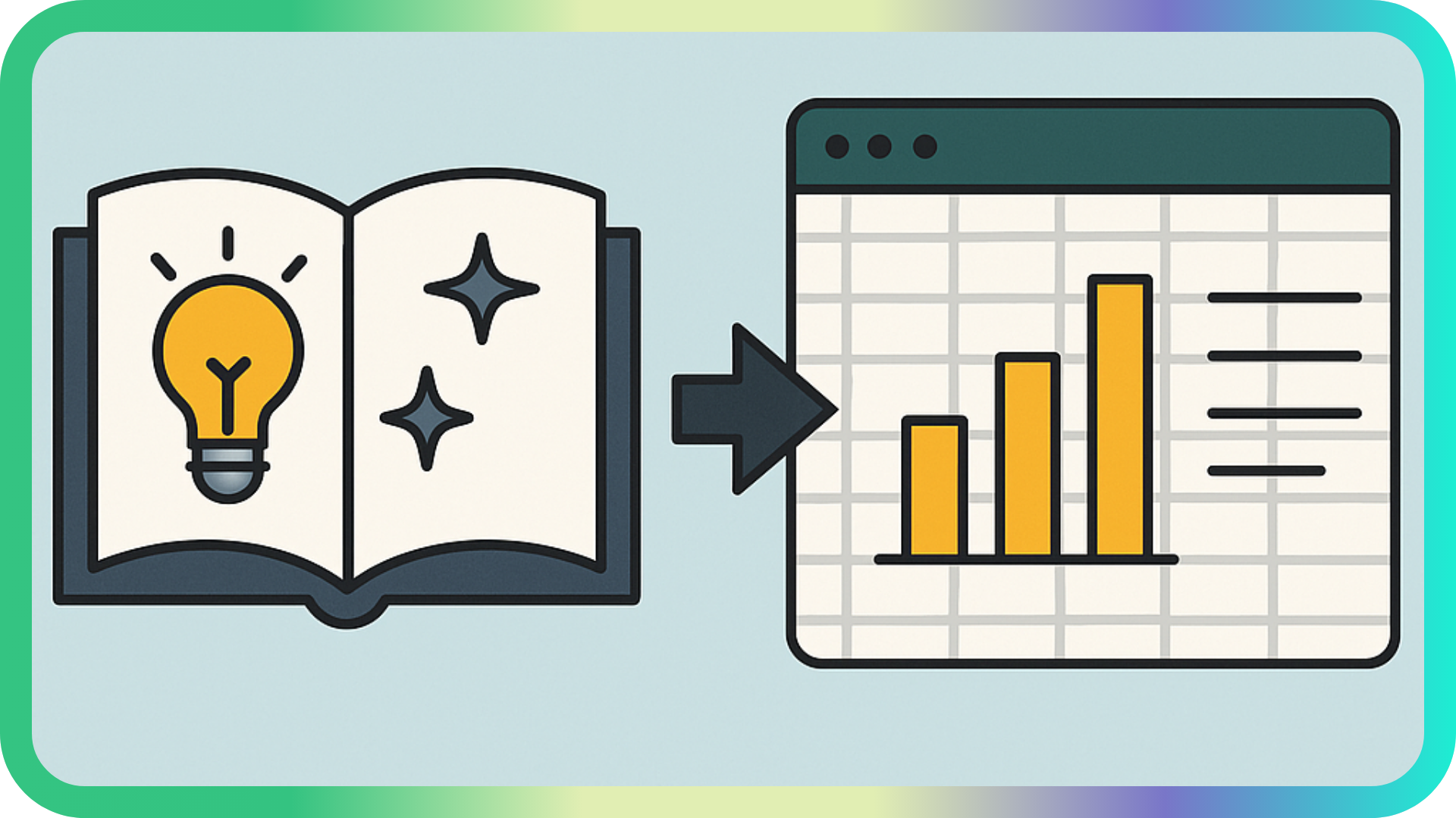
Probably a never-ending grid of data, long-winded formulas, and the odd chart. However, Excel is so much more than a mere spreadsheet tool — it’s a storytelling medium.
More than ever, relying solely on numbers isn’t enough. Much has been made of how technology and social media have significantly contributed to everyone’s seemingly shorter and shorter attention spans, and the same applies to how we consume data. That’s why it’s pivotal to blend style with substance.
Let’s break down the most important facets of storytelling in Excel so you can propel your reports and dashboards to the next level.
Start with the story, not the spreadsheet
Diving straight into the formulas and visuals is naive at best. It starts with purpose and direction.
Ask yourself:
- What question am I trying to answer?
- Who is the intended audience, and why should they care?
- What decisions should the insights lead to?
As with any great story, there should be a beginning, middle, and end:
- Beginning: Set the stage by revealing the problem or opportunity.
- Middle: Explore the data by highlighting the patterns, trends, drivers, and outliers.
- End: Deliver the conclusion and suggested actions.
Know your audience

People have different needs, expectations, and abilities, and their occupations heavily influence that. Therefore, the way you present your data needs to reflect those things.
Tailoring your layout, visuals, and level of detail is crucial for getting the message across in a way that resonates.
Executives (CEOs, CFOs, directors)
They want high-level insights, strategic takeaways, and concise visuals.
- Focus on top-level KPIs and keep details minimal.
- Use strong summary statements such as Revenue rose 8% due to….
- Avoid overly technical jargon or granular data.
Your story should answer: What happened? Why? And what should we do about it?
Analysts and data professionals
They want detail, control, and the ability to drill down.
- Provide raw data on separate worksheets for full visibility.
- Use slicers, filters, or Power Query steps for exploration.
- Include clear explanations of the methods and calculations used.
Your story should say: Here’s what we found — and here’s how we found it.
Operations managers or team leads
They want actionable insights that reveal team performance, logistics, or process improvements.
- Display trends, bottlenecks, and comparisons over time.
- Use conditional formatting to flag problems.
- Prioritise operational metrics such as delivery time, productivity, and units processed.
Your story should say: Here’s what’s working — and here’s what needs fixing.
Sales and marketing teams
They want to know about audience behaviour, campaign performance, and revenue impact.
- Use charts and PivotCharts instead of tables for quick insights.
- Emphasise customer trends, regional performance, and segmentation.
- Highlight conversion rates, ROI, and month-over-month growth.
Your story should say: Here’s how we’re performing — and here’s where the next opportunity lies.
Trainers or educators
They want clarity, learning progression, and examples.
- Use simple, annotated visuals.
- Explain key terms and context.
- Organise worksheets in a logical, step-by-step format.
Your story should say: Here’s how this works — and here’s how you can use it.
Use visuals that support the story
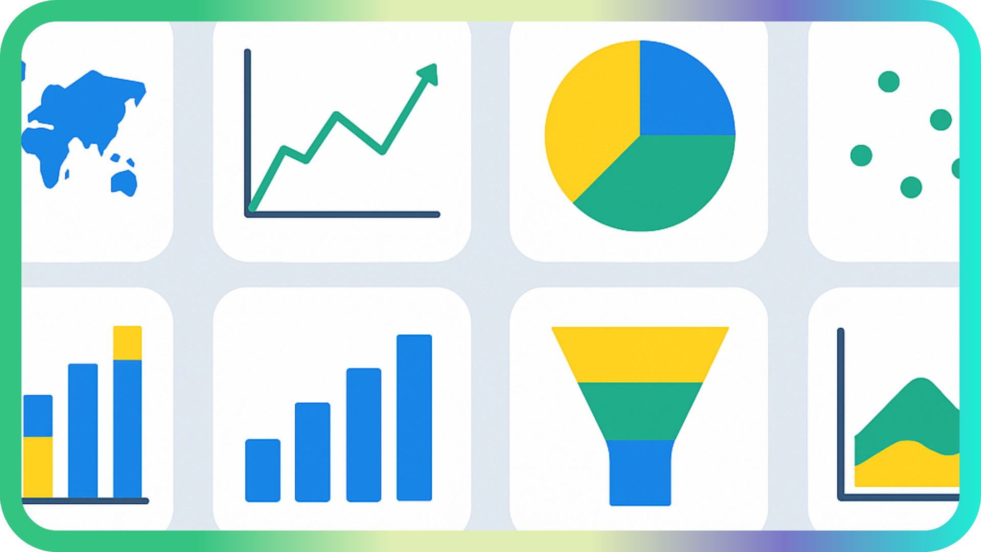
Excel has a wide range of charts that are highly customisable, and these form a core part of storytelling. However, always think carefully about the appropriateness of the charts you’re using and whether they are the optimal way to get your message across.
The rule of thumb is:
- Map charts for geographic data
- Line charts to show trends over time
- Pie charts for category comparisons
- Scatter plots for showing relationships
- Combo charts for combining two chart types
- Column and bar charts to compare categories
- Funnel charts for showing the stages in a process
- Area charts for visualising volume-focused trends
- Waterfall charts for showing step-by-step changes
- Box & whisker charts to show medians, quartiles, and outliers
Excel may not have the raft of visuals that Power BI has, but it’s more than adequate for most intents and purposes. After all, how many of these charts have you actually used?
Oh, and by the way — is there a more divisive option than a pie chart? Don’t be put off! Just don’t overload it with categories.
Keep it clean, simple, and focused

Great storytelling is not just about what you include — it’s also about what you don’t include. Resist the urge to overload your story with every data point, every chart, and every possible view.
All this does is overwhelm your audience and drown out the key message. Separate the wheat from the chaff and opt for clarity over complexity.
After all, you’re telling a story, not building a data dump, so remember those famous words: Less is more.
Guide understanding with context
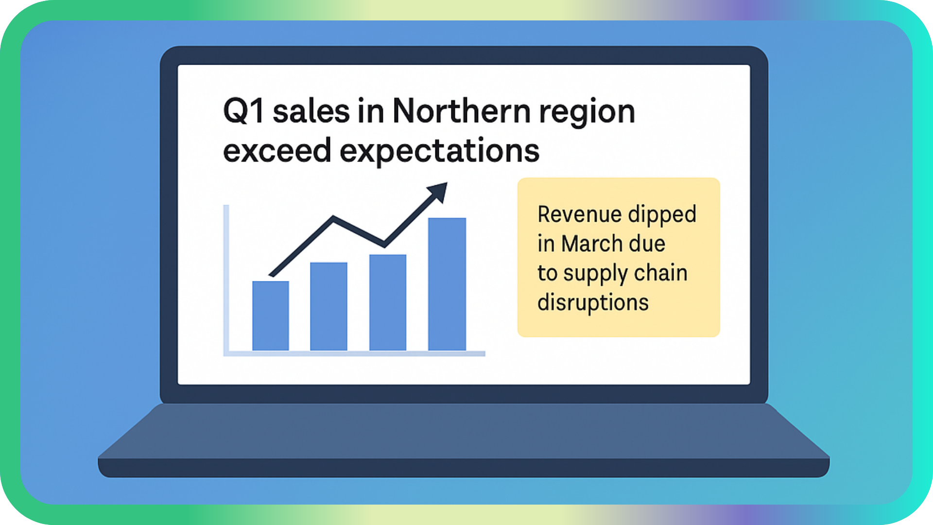
Even the most easy-on-the-eye chart can fall flat if the user doesn’t have a clue what’s going on.
Context is everything. Use titles, annotations, and short summaries to guide the user’s understanding.
For example:
- Instead of titling a chart with something dull and generic like Sales by Region, put Q1 sales in Northern region exceed expectations.
- Use text boxes or cell comments (notes) to explain anomalies or outliers.
- Include a short summary next to key visuals. For example, Revenue dipped in March due to supply chain disruptions.
Keep in mind that you are the narrator, so help your audience to see what you see.
End with impact

What is the key message you want to deliver?
There should always be a clear takeaway, so end with a point, punchline, or call to action.
Whether you’re making a recommendation, revealing a risk, or suggesting a roadmap, don’t leave your audience in the dark.
For example, don’t just say Sales were up last quarter.
Instead, say Sales increased 12% overall, but 80% of that growth came from a single product — this should guide our Q2 focus.
Moreover, make sure your takeaway stands out visually. Consider the font size, weight, and colour, as well as borders, text boxes, cell comments, shapes, or conditional formatting to do this.
Learn from a storytelling maestro
Fancy injecting some life into your data stories so they burst with style and substance?
Well, we have something for you…
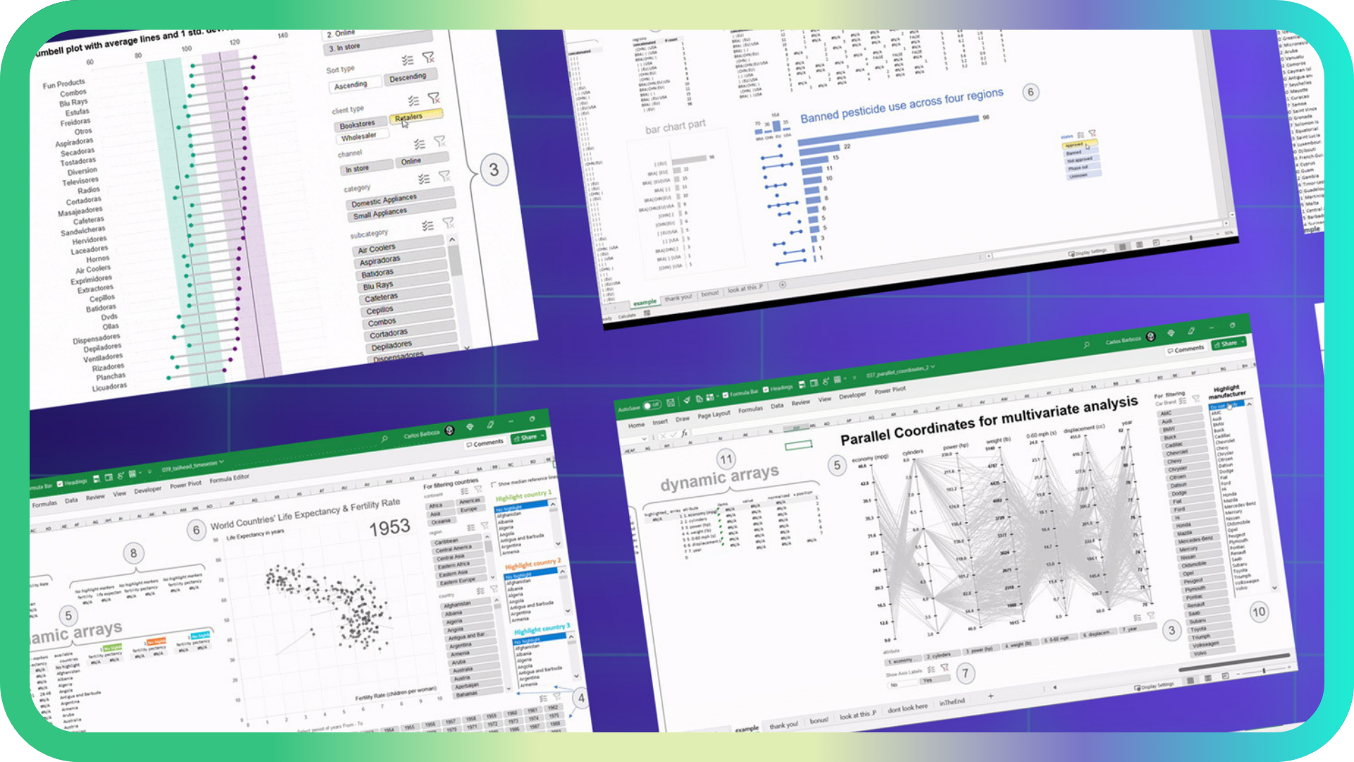
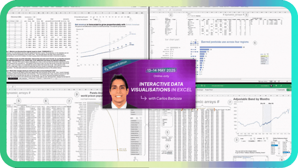
Carlos Barboza is set to deliver a special online Masterclass demonstrating advanced ways to build interactive data visualisations in Excel.
The Portugal-based Peruvian is famous on LinkedIn for pumping out dazzling and dynamic dashboards that frequently leave users awestruck.
He's also wowed the crowd in London at the last two Global Excel Summits.
To learn all the Microsoft MVP's tips, tricks of the trade, and discoveries, get your ticket for his May Masterclass (13–14 May 2025). You will walk away being able to tell data stories that stick!
See you there!

Latest Articles
.png)
Sheetcast - A Natural Evolution for People Who Love Excel
.png)
How to Build Your First AI Agent in Excel
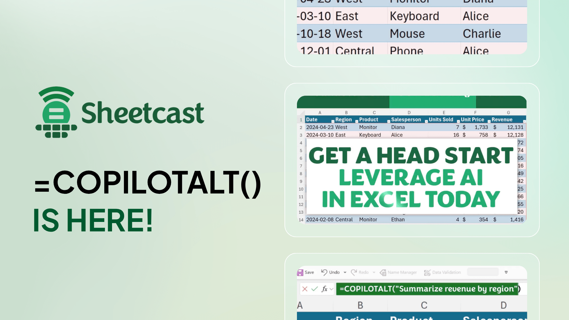
Leap into Excel’s AI revolution with COPILOTALT by Sheetcast
Join the Master Club
Your exclusive all-access pass to our entire digital learning experience for a whole year.
.png)