
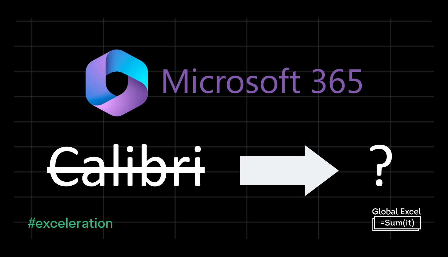
Last week, Microsoft announced a new default font in Microsoft 365 (formerly Office) to replace the long-standing Calibri, which has been top of the pecking order since Office 2007.
The process started back in 2021 when they asked consumers for feedback on five fonts they had commissioned as possible replacements: Bierstadt, Grandview, Seaford, Skeena, and Tenorite.
After much deliberation, Bierstadt was crowned victorious; however, it swiftly received a name change, becoming Aptos. Perhaps it was deemed inappropriate to proceed with a font that translates to 'Beer City' in German. To avoid confusion, though, the original name will still be selectable in the font dropdown.
In a world of ever-increasing screen resolutions, it's said that Aptos has greater legibility, especially at small text sizes. Moreover, one of many people's observations is it's much easier now to tell the difference between an uppercase 'i' and a lowercase 'L'. Although, this is clearly still an issue in many places…
I ≠ l
See what we mean? 😉
Here's every number and letter compared:

You'll notice other small differences with Aptos, such as the lack of base on the '1' and the curlier tails on the uppercase 'Q' and lowercase 'y'.
Microsoft says the update is rolling out to users over the next few months, so it may take a while before your new Excel workbook defaults to the new font.

It appears that Aptos has divided opinion so far. Some people prefer it — others don't. Will you be switching to Aptos without any fuss, or is the continuity of Calibri your preference?
As long as none of you are using Comic Sans, it's probably all right. 😄

Latest Articles
.png)
GES and MEWC Partner to Create Europe’s Premier Excel Week

ICAEW Confirms Continued Partnership with the Global Excel Summit
.png)
Global Excel Summit Returns to London in May 2026!
Join the Master Club
Your exclusive all-access pass to our entire digital learning experience for a whole year.
.png)