

More often than not, you don't want an excess of full-scale charts clogging up your worksheet. That's where in-cell charts come into play, as they conserve space yet provide an effective way of glancing over data to make quick judgements.
Excel has a couple of options for this, namely Sparklines and Conditional Formatting. The latter features something called Data Bars, which are mini horizontal bar charts representing values in cells.
While these can be sufficient, the drawback is the coloured bars sometimes affect the readability of values if they happen to collide with each other. You also need a column width significantly wider than the values themselves to make them truly worthwhile.
An alternative is the clever use of a formula.
In the video example, sales data is present, with the monthly figures housed in B2:B9.
Using =REPT("|",B2:B9) in the adjacent column repeats the pipe symbol (|) a set number of times according to each sales value.
After changing the font from Aptos to Stencil, the pipes (|) turn into overly long continuous bars. Dividing the range B2:B9 by 10 drastically reduces their length, making them easy to interpret.
To go one step further, a threshold value of 500 is added in E2, followed by the creation of two conditional formatting rules to check if the sales value is greater than (=𝙱𝟸>$𝙴$𝟸) or less than (=𝙱𝟸<$𝙴$𝟸) this number. The bar is displayed in green if it is, and red if not.
For more Excel tips and tricks like this, check out our Video Tutorials page.

Latest Articles
.png)
Sheetcast - A Natural Evolution for People Who Love Excel
.png)
How to Build Your First AI Agent in Excel
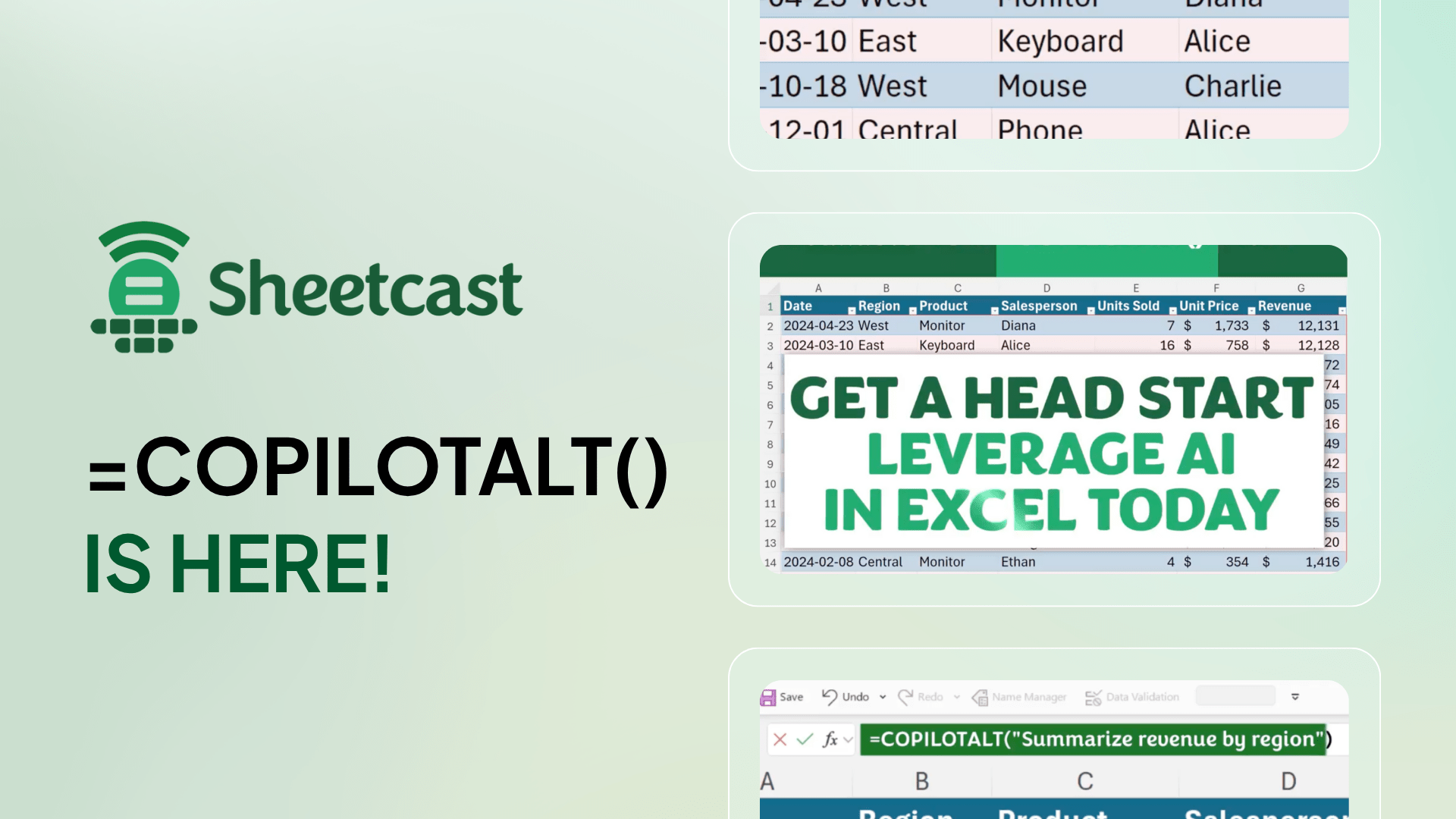
Leap into Excel’s AI revolution with COPILOTALT by Sheetcast
Join the Master Club
Your exclusive all-access pass to our entire digital learning experience for a whole year.
.png)